Creating a responsive WordPress website that works well on mobile devices is essential in today’s digital age. With over 50% of website traffic coming from mobile devices, it’s important to have a website that is optimized for all screen sizes. In this article, we’ll guide you through the process of creating a mobile-friendly website that is visually appealing and user-friendly.
Why is Mobile Optimization Important?
Mobile optimization is crucial for a variety of reasons. Firstly, it improves the user experience of your website, making it easier for visitors to navigate and consume content. Secondly, Google has started penalizing websites that are not mobile-friendly in their search rankings, leading to a decrease in traffic and visibility. Finally, a mobile-friendly website can improve your website’s load time, which is essential for keeping visitors engaged.
So, how do you make sure your website is mobile-friendly? Here are some tips:
Step 1: Choose a Responsive WordPress Theme
Choosing a responsive WordPress theme is the first step in creating a mobile-friendly website. Responsive themes automatically adjust the layout of your website to fit the screen size of the device it is being viewed on.
Some popular responsive WordPress themes include:
- Divi: a versatile theme with a drag-and-drop builder
- Avada: a multi-purpose theme with customizable layouts and design options
- Astra: a lightweight and customizable theme with a focus on speed
- OceanWP: a fast and flexible theme with a range of free and premium extensions
- GeneratePress: a lightweight and easy-to-customize theme with a focus on performance
Choose a theme that fits your website’s needs and customize it to make it unique to your brand.
Step 2: Optimize Your Images
Images are an important part of any website, but they can also slow down your website’s load time, especially on mobile devices. To optimize your images for mobile devices, follow these tips:
- Compress your images using a plugin like Smush or ShortPixel.
- Use the correct image size for your website’s layout.
- Use the correct file format (JPEG for photographs, PNG for graphics).
- Use descriptive file names and alt tags for your images.
By optimizing your images, you can improve your website’s load time and make it more user-friendly on mobile devices.
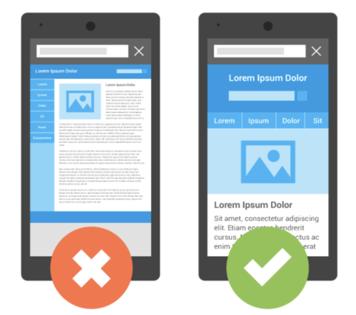
Step 3: Use a Mobile-Friendly Menu
A mobile-friendly menu is essential for a mobile-friendly website. Traditional desktop menus can be difficult to navigate on a small screen, so it’s important to use a menu that is easy to use on mobile devices.
Some popular mobile-friendly menu options include:
- Hamburger menu: a simple and recognizable menu icon that expands into a full menu when clicked
- Slide-out menu: a menu that slides in from the side of the screen when clicked
- Tabbed menu: a menu that uses tabs to organize content and make navigation easier
Choose a menu style that fits your website’s needs and make sure it is easy to navigate on a mobile device.
Step 4: Use a Mobile-Friendly Font
Fonts can also impact your website’s load time on mobile devices. To ensure your website is mobile-friendly, use a font that is easy to read on a small screen and loads quickly.
Some popular mobile-friendly fonts include:
- Open Sans: a clean and modern font that is easy to read on all devices
- Lato: a versatile font that is both stylish and easy to read
- Roboto: a popular font that is designed for readability on both desktop and mobile devices
- Montserrat: a bold and modern font that is great for headings and titles
- Raleway: a sleek and minimal font that is easy to read on small screens
Choose a font that fits your brand and is easy to read on a mobile device.
Step 5: Test Your Website on Mobile Devices
Once you’ve optimized your website for mobile devices, it’s important to test it on a variety of devices to ensure it works well on all screen sizes.
Use tools like Google’s Mobile-Friendly Test or BrowserStack to test your website on different devices and screen sizes. Make sure your website is easy to navigate, loads quickly, and looks visually appealing on all devices.
Conclusion
Creating a mobile-friendly website is essential in today’s digital age. By choosing a responsive WordPress theme, optimizing your images, using a mobile-friendly menu and font, and testing your website on different devices, you can improve your website’s user experience and search rankings. Remember, a mobile-friendly website is not just about having a responsive design – it’s about creating a website that is easy to use and engaging for all visitors.
[…] How to Create a Responsive WordPress Website That Works Well on Mobile Devices? […]